UX/UI Experiment: GoodReads
Re-design Challenge - Interface & Graphic Design - Prototyping
GoodReads is a platform centered around books and the discovery of reading experiences. As a hobby project, we decided to re-design the platform, with a focus on the digital design and user interface aspects. The re-design of the platform was made primarily with the idea of how you might discover and catalogue books.
On this page, you will first find a presentation of the “finished” look (is a design ever really finished?). If you want a deeper look into the process, just keep scrolling - and remember, while this might look very linear and straight-forward, it did take several iterations and back-and-forth before arriving at the final look. Enjoy!
The project was primarily made with Figma (wireframing + prototyping) and Procreate (sketching).
This project was made in collaboration with Casper Boonen
The “Finished” Look.
The platform contains three primary components: The frontpage (“Discover”), a search- and browse-page (“Browse”), and a library page (“Library”). Each book also has its own “presentation”-page, which can be accessed by clicking on the book-covers throughout the platform.
Discover.
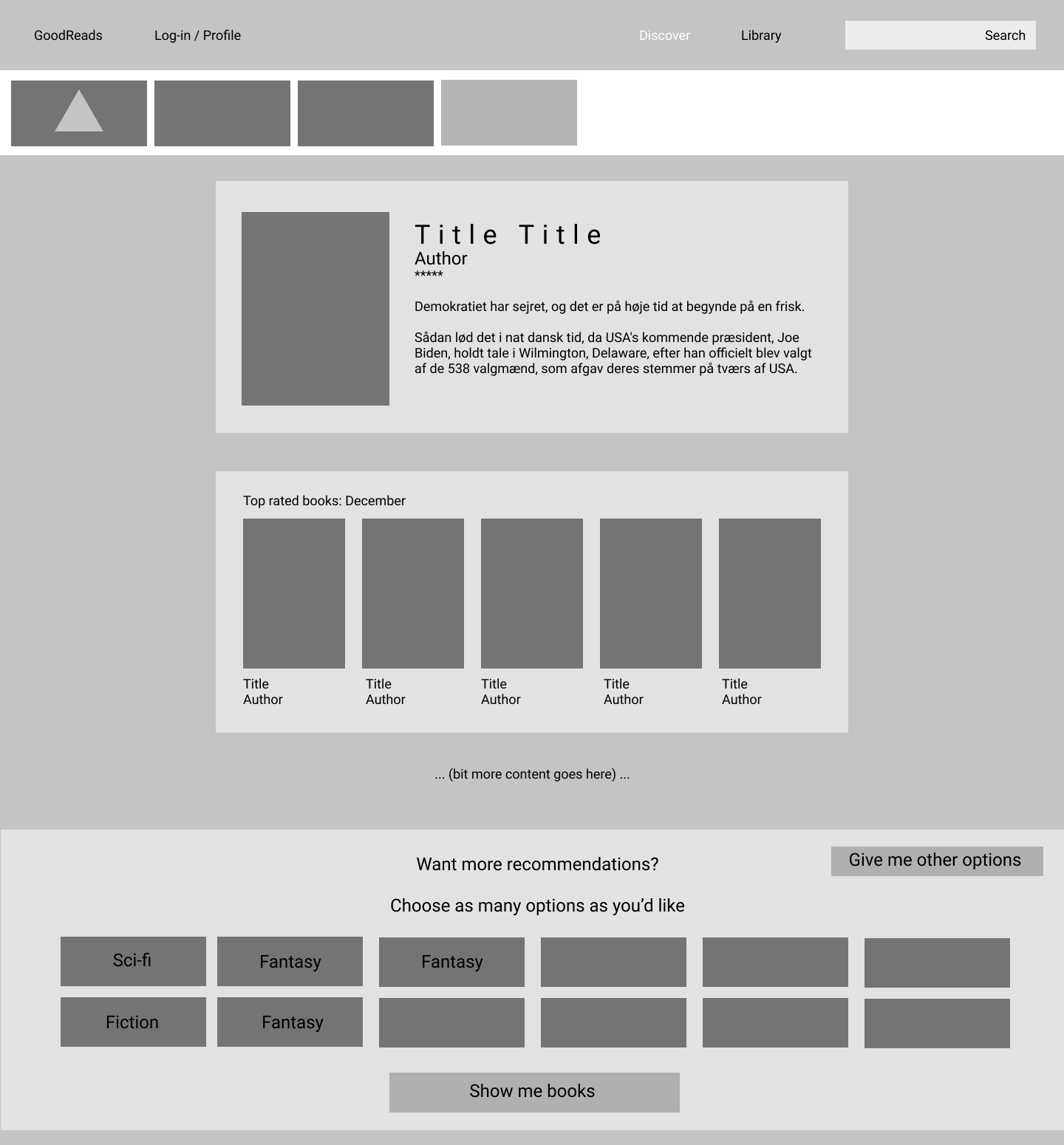
The Discover-page is a non-committing way of looking for (new) books, where the user does not have to input anything to get recommendations. The recommendations will, though, also be less specific to the user's current wishes. It should be seen similarly to a front-window-display of a bookstore: (Possibly) impersonal, but accessible and broadly applicable, with a soft focus on recency.
Browse & Search.
On the Browse-page the user is presented with the option to find new books based on various filters. The books are presented in a grid-structure, with the primary focus being the cover of the book; the title and author is also available in this grid.
Library.
The Library is the page in which the user can browse and review their current collections of books. This can both be books they already own, books they want to read, or books that the user for whichever other reason has decided to keep tabs on. All books on the platform can be sorted into user-defined “shelves” in their library; no proof-of-purchase or otherwise is required. It is completely up to the user, if and how they want to save, sort and organize books.
Profile.
On the profile page, the user can - if they have created a profile (which is optional) - view information about their own reading. Such as, the amount of books read within a certain time period, which book they are currently reading and how mange pages they have read in total.
Notable interaction: The Quicklist.
The Quicklist is a way of keeping tabs on books the user may want to review later, before choosing their next reading experience. The Quicklist therefore exists throughout all pages on the platform. It is accessible already from when you enter the frontpage for the first time. All books presented on the platform can be added to this list, to allow the user to quickly save the books for later review, without necessarily committing to “wanting to read it” (yet).
It is a way of not having to open several tabs of books in a browser, as the user will not “lose” any books that they might find interesting, if they add them to the Quicklist. The Quicklist mimics the way one might take out several books and carry them around when browsing a bookstore or library, and then make a final decision on which books they want to buy/read a little later.
The Quicklist can be managed as “special” collection in the Library, and interacted with through the pop-up available on all pages.
The Process.
Research.
To explore, we conducted a broad brainstorming and research-session into several areas, such as what a reader may categorize (and choose) a book by, and how to design for nuanced search-queries with complex parameters. This included condensing the findings into customer profiles (jobs, pains and gains).
Sketching.
To get our initial ideas into the world, we created a number of sketches, exploring various aspects of the platform. This allowed us to quickly spot what worked and what didn’t, as well as to quickly iterate on the ideas that we preferred. In working collaboratively, sketching also allowed easier communication about our ideas, as explaining a visual idea can otherwise be difficult.
Wireframing.
Similarly to sketching, creating some preliminary wireframes allowed us an exploration into the dimensions and placement of various objects on the platform.
Iteration.
The process of design is often not a straight-forward line from “A” to “B”. The same can be said about this re-design, which went through multiple iterations. This is both in regards to the visual layout and the functionality.


